THE VISION
Without hesitation, our clients jumped at the opportunity to purchase this 1960s ranch-style home in their dream neighborhood in Leland Grove. Loving to cook and knowing many of their hours would be spent in this kitchen, she was eager to start the big transformation. With the kitchen at the top of the list, they are now full speed ahead infusing mid-century modern style throughout the home. While making the space beautiful was a top priority, optimizing the functionality and maximizing storage space was not far behind. The beauty of their “forever home” mindset was their clear vision and ability to prioritize needs and wants.
- Optimize storage and functionality. Although this home meant downsizing, they were unwilling to sacrifice the luxury of a well-equipped and functional kitchen.
- Achieve Mid-Century Modern style. Their collected and curated items over the years carry this iconic vibe.
- Brighten the space. Maximize the small footprint and standard 8’ ceilings with design choices.
Highlighted Scope of Work
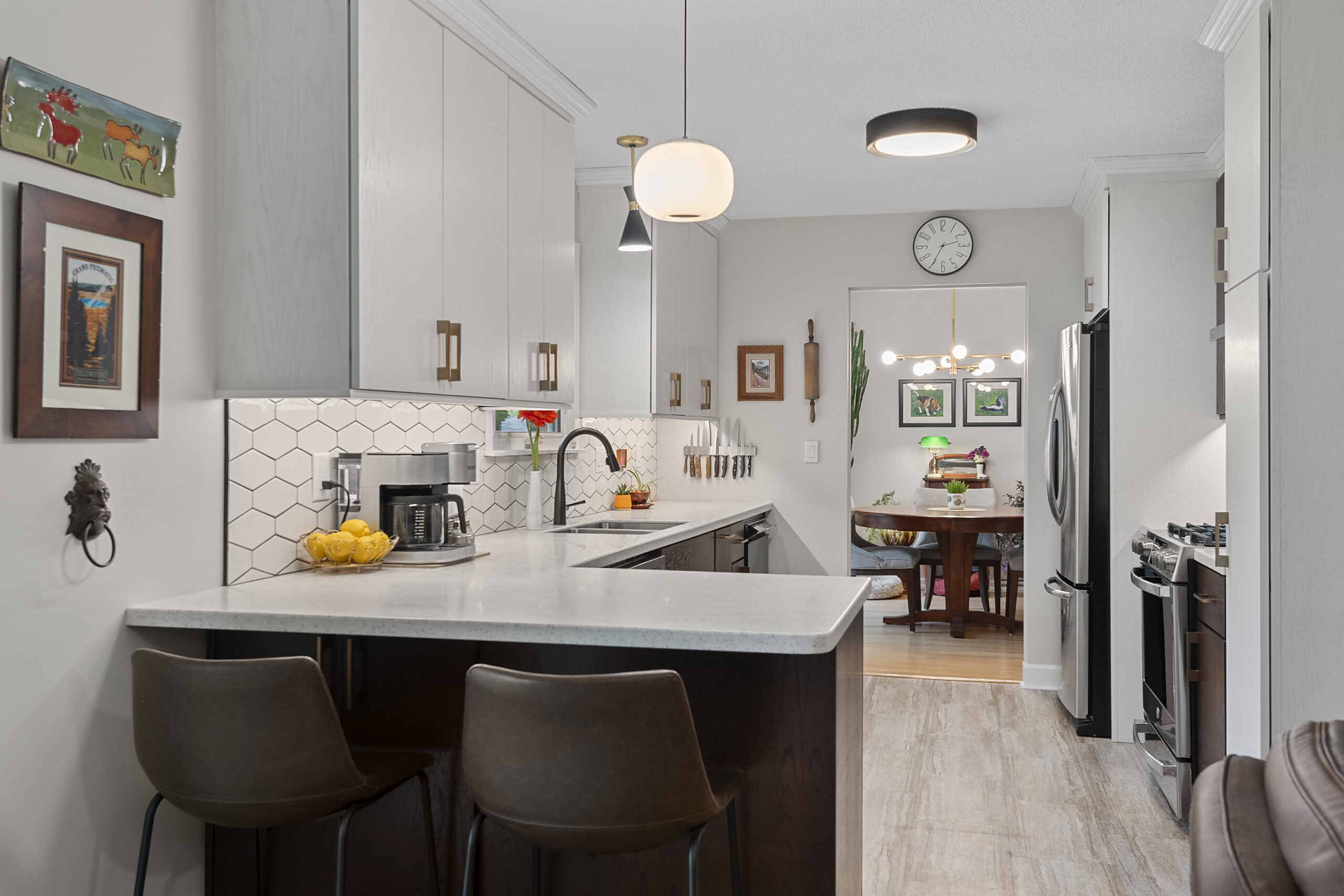
Before, the kitchen was dark, despite having natural light through the window above the sink. Due to the darker (upper AND lower) cabinets paired with darker countertops, the space absorbed all the light, appearing not only darker but smaller! With the removal of the upper cabinets above the peninsula, designing all other wall cabinets to ceiling height and adding additional storage underneath the peninsula all add to the beauty and functionality of this space!
LIGHT AND BRIGHT
Now, we have a harmonious blend of a bold color palette and modernization that turns this small, heavy kitchen into a revived Mid-Century Modern Beauty.
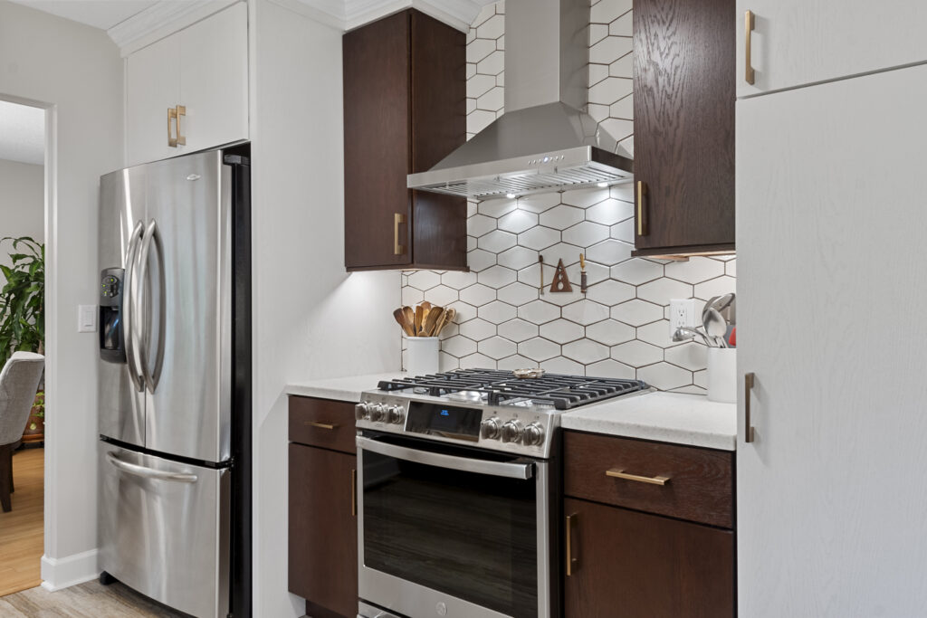
To help maximize the light in the space, we removed the soffits throughout and added new wall cabinets to reach the ceiling allowing for a more modern, streamlined look.
Removing cabinets over the peninsula allows natural light to flow through as well.
STORAGE SOLUTIONS
Before, the kitchen had inaccessible drawers, inefficient access points, and a lot of dead space. With intentional design featuring interior cabinet elements, there is now a place for everything.
- Intentional spice rack for the expert cook,
- Drawer divider for utensils, and
- Base cabinet drawer pullouts to make pots and pan storage effortless.
About the Fabulous Finishes
The list of exciting changes and fantastic finishes chosen for this new galley kitchen includes:
- Additional and more functional storage
- Soffits are removed throughout
- New Mannington Adura LVT floors
- Showplace Cabinetry | Milan doors in Red Oak | Harvest and White II
- Large crown moulding
- Roll trays in lower cabinets
- Bellavati Solid Surface countertops | Paramount
- Soho Studio 4×8″ Rumba Diamond Ivory tile backsplash with Nutmeg grout
- Blanco stainless steel under-mount kitchen sink
